In 2022, I was approached to collaborate with two women co-founders to re-launch a personal branding startup. We rebranded the company from Ossu to Distinctly to better reflect its mission of building distinct personal brands for influential leaders fighting inequality and seeking positive change.
We conducted user research to understand the product demand and better define our target audiences. Our discovery process found many professionals in need of guidance on how and where to communicate their experience and expertise. This led us to restructure the product, focusing on the customers' foundational needs (copy tonality, content strategy, etc.) rather than the previously offered personal brand package (logo, business cards, etc.).
We also identified LinkedIn as the optimal platform for personal branding and voice amplification. Early data showed that LinkedIn conversion outperformed peer platforms by as much as 277% in generating leads and building professional connections.
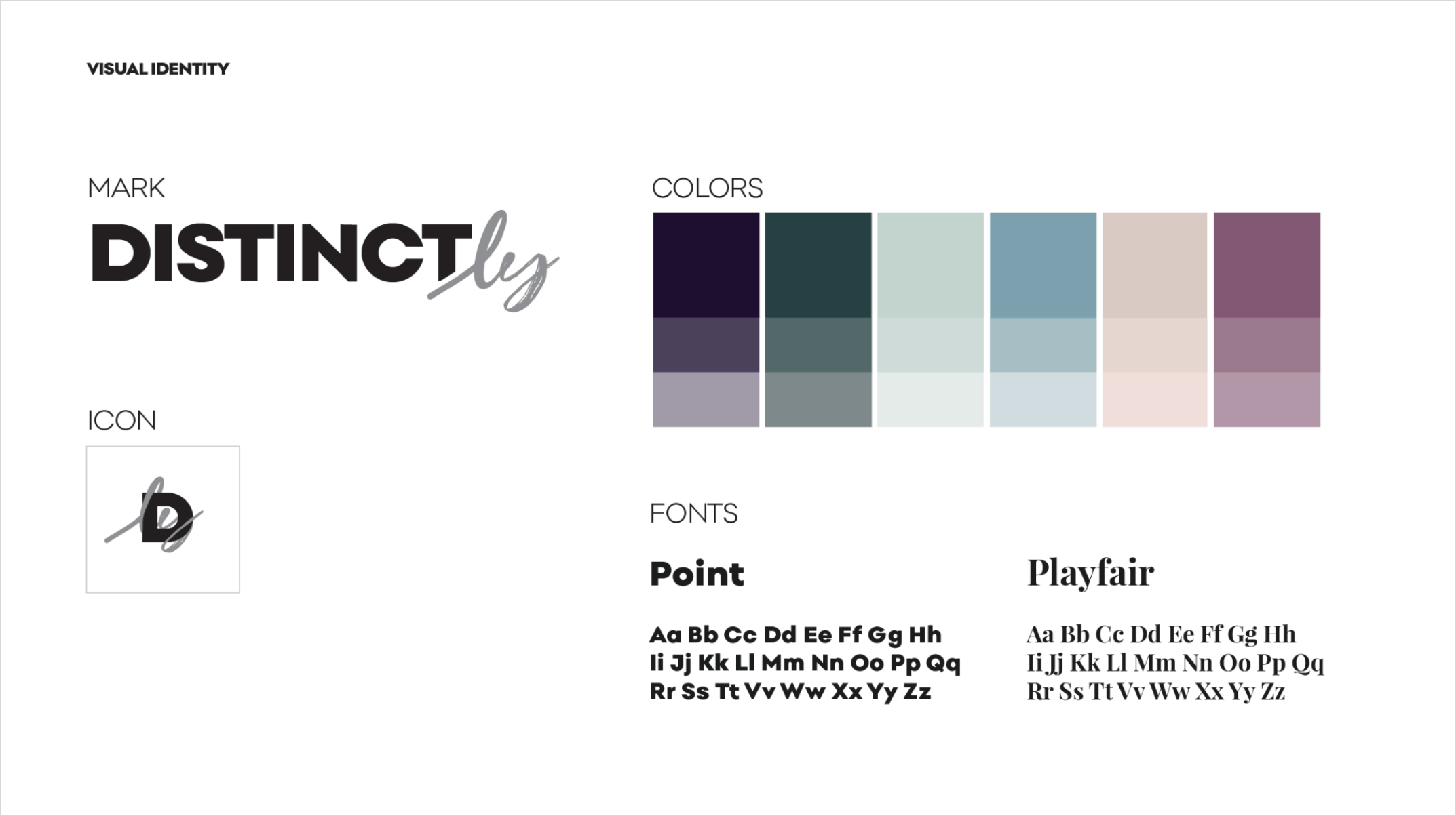
The Distinctly identity embodies the complexity of human nature and the duality between strength and imperfection. We created an equilibrium between two contrasting elements within the mark—a bold sans serif vs. hand-scripted 'ly,' evocative of a signature, a highly personal symbol—and throughout our verbal expression (i.e., "we are tough and we care about others"). We extend the use of the hand-scripted element throughout our visual expression as a decorative scribble that energetically reflects the personality of Distinctly’s customers.
It was a humbling experience building a company and designing a product that elevates the voices of those who've overcome hardships yet march on with meaning and purpose to create positive change in their social circles.